Rebuilding Search, Find and Buy for HVAC Field Contractors
Case Study - Field Service Mobile

Role
UX Lead Consultant
Year
2024
Client
Johnstone Supply
Industry
HVAC E-commerce
Overview
Johnstone Supply's field contractors needed a mobile app they could actually trust for finding, pricing, and buying parts, not just browsing. This case study walks through the core shopping experience of Search-Find-Buy journey including: sign in, account recovery, home, search, product pages, three cart directions I explored, checkout before and after, quick order, and order confirmation.
Discovery with Johnstone Supply run like a research project first
Five stakeholder groups, one company used to strict sign-offs. Before designing anything, I needed proof strong enough that no group could easily argue with it.
26
Interview Sessions
17
JS Store Groups
28
JS Distributors
13
Contractors
17
JST Stakeholders
25+
Artifacts Reviewed
500+
Data Points Coded
4
JS Sites/App Audited
6
Competitor Apps Study
4
End-to-end Journeys
SUmmary Observations
Contractors and distributors expect JS mobile to be easy to use, accurate, and offer a strong value proposition
Clear strengths exist, but too many barriers to adoption and too much friction in search / find / buy
The most impactful and urgent problems must be solved first for contractors to save time, save money, and grow their business
Contractor: Outcomes to Achieve
Save time and money
Increase technician productivity
Find warranty, specs, and certifications
Track order / invoice / quote history
Distributor: Outcomes to Achieve
Situate contractors for success using mobile
Help contractors grow their business
Enable access to info, price, availability
Drive more business thru ecommerce
Free up the store counter ⭐️
Improve the mobile experience
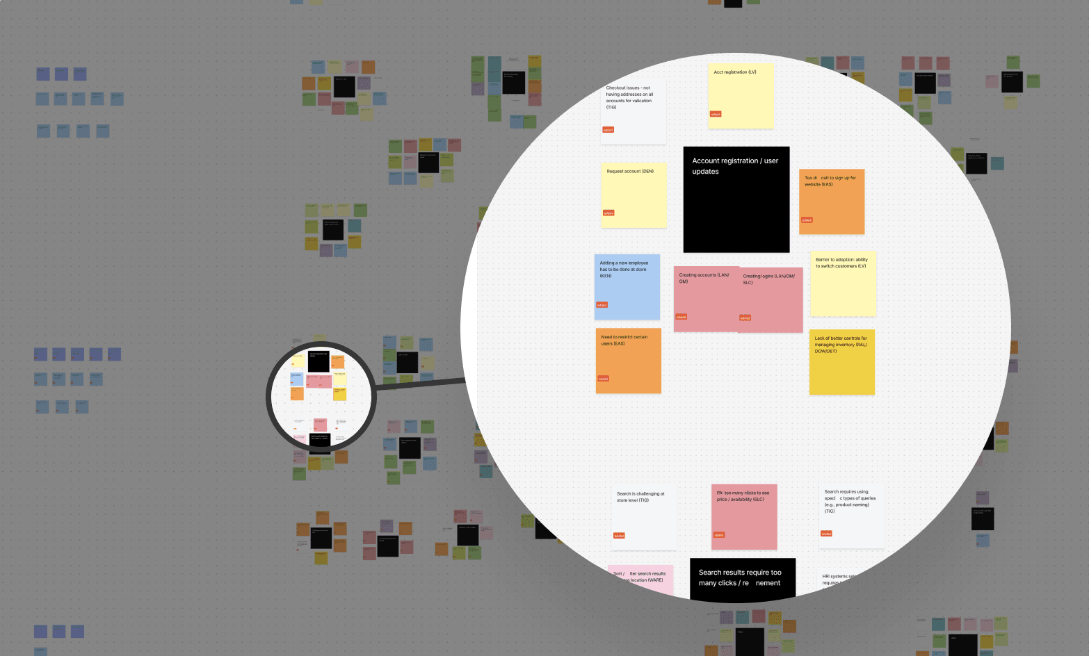
Mobile Discovery Workshop: Problems to Solve
Purpose: Align on the key problems to solve for customers (contractors) and the business (stores + JST) in the context of mobile services.
Objectives:
Understand the customer and business outcomes to achieve, and the problems/pain points standing in the way
Assess the problems that could be solved by identifying the most impactful and urgent issues
Prioritize the problems that should be solved by deciding what to address now, next, or later

Mobile Discovery Building Blocks, 2 weeks
Impact vs. urgency prioritization matrix
Impact versus urgency matrix with the exercise rules on the left: assess impact first, then urgency, then fine-tune placement to avoid problems clustering in one area, with problems plotted and color-coded by journey stage.

Persona & User Journey
PErsona
Meet Connor: the contractor every decision traces back to
Connor is a composite built from the interview pool, contractors, store staff, and distributors describing the same routines and friction points.

The user journey mapping
Connor's six-stage journey map across Discover, Register/Login, Search/Find, Buy/Order, Track/Receive, and Retain, with needs, pains, touchpoints, thoughts and feelings at each stage.

Userflows
Turning the journey into 4 flows
Four flows mapped: Register/Onboard, Find/Buy, Replenish, Track/Receive. Green marks touchpoints outside the app, a phone call, a store visit, a paper form.
Register and Onboard: sign in, request account, verify, receive credentials

Find / Buy: search or scan, check price and availability, add to cart, place order

Replenish: open a saved list, adjust quantities, reorder without searching again

Track and Receive: order placed, confirmation sent, track, receive

Design System - The minimum Viable APproach
Building the design system while building the app
There was no design system when this project started. Every screen in this case study was built while the system itself was still being assembled, piece by piece, alongside the product.
The Minimum Viable Approach
Settle the basic global styles first: color, type, icons, so brand stays consistent from day one
Add the most frequently reused components next: buttons, input fields, cards
Turn recurring patterns into reusable combinations: alerts, steppers, empty states
Keep expanding the library as new needs come up, never stop to rebuild it all at once

Global styles: color system, type styles, grid, and logo variants

Toasts

Buttons

Alerts

Steppers

Bottom Navigation
And many more
Only a few select set of components from the design system built for the Johnstone Supply mobile app is presented above. The full system is significantly more extensive which has over a dozen additional component categories built to support the app's varied workflows, including breadcrumbs, carousel, divider, floating action buttons, input fields, select fields and labels, overlays, pills, push notifications, quantity counters, search, select, stepper, table, tabs, toggle, and tooltips, and many more.
JST didn't have a name for what a design system even was. Marketing heard "design system" and assumed we were trying to rewrite their brand guidelines. It took several rounds of syncs, walking through the difference between a brand guideline and a component library, before that fear settled. The minimum viable approach helped here too: showing up with a small, working slice instead of a big proposal made it obvious we weren't touching their logo or colors, just organizing what already existed.
From flow to wireframe
Before the polish: an early wireframe pass
Flows turned into a basic wireframes with core screens then prototype to gauge skateholder and clients' observations and access teachincal feasibility. This is an early pass sign in, quick actions titles, the cart-to-checkout flow: a red stepper, placeholder text, and an approval step that didn't make it to later rounds.

Early prototype
What changed later
The stepper moved from this 3-step cart flow into the checkout flow
The color system shifted to Johnstone's blue
"Pending approval" was dropped once discovery showed most orders didn't need a supervisor sign-off.
Sign in & Store Context
From flow to screen: getting a contractor into the app
Sign in isn't self-serve. JST only works with licensed contractors and businesses, so a new user has to preregister in person at a store before they ever get credentials, shown as the "Request an Account → Find a Store → Choose a Store → Sign Policy Agreement" path on the Register and Onboard flow a few sections back. The store confirms the business and its license, then submits the account for approval before login even becomes possible.
Request an Account

Request an account flow

Store locator/Modification
Sign in flow

Sign in + Biometrics
Account Recovery
Contractor requests this
Password and login problems came up constantly in interviews, tied to a separate login system that didn't sync with the app. Every error state and backup option had to be designed, not just the happy path.

8.Home Dashboard
Everything a contractor needs, above the fold
Order status, recently viewed parts, recommendations, and category browsing all need space on the same home screen. Quick Actions, a shortcut grid contractors can customize, was the feature I spent the most time on, including how editing and reordering work.

Search & Product Detail
From a part number to an answer, in one screen
Pricing tiers, substitutes and add-ons shows on Product Details screen instead of after checkout. This answers the biggest thing we heard in research: contractors want to know what's really in stock before they commit to a part.

Search Logics

Product details: Pricing tier, substitutions, 360 view
CART - Design Exploration
Cart: MVP shipped
MVP cart version without bulk modify, showing partial stock and out of stock states with inline substitution options, plus recommended and everyday essentials merchandising modules.

Cart showing price, stock availablity, subs and add-ons

Cart Details

Discounts & Promos
Checkout - Before & After

Before
Shipping and billing in one screen, unclear field labels, and long information input process without any visual indicator

After
A three-step Shipping, Billing, Review stepper, consolidated contact, shipping, and billing information
Quick Order
Buy Now: ordering by part number alone
Built for contractors who already know what they need. They can type or scan a part number, see stock warnings right away, confirm the order, and get the same confirmation on both web and mobile.

Nameplate Scanning and Buy Now quick order flow
Working With a Layered Client
Five layers of leadership, five different reasons to say no
Johnstone isn't one client. It's five layers stacked on each other, each with its own goals and its own power to say no. Nothing shipped with one yes. Everything needed five, in five different languages.

The real work wasn't just in one conversation. It was explaining the same decision five times, in five ways, without changing the decision itself. Trust built up over time.
WHat is next?
What's next for the app
This case study covers the core buying path: search, cart, checkout, quick order. The next phase moves toward a more complete experience:
Order history: a full record of past orders, invoices, and quotes in one place
Account: expanded account management beyond store and password settings
Contractor tools: system selectors, motor finders, and other trade-specific tools surfaced clearly instead of buried in menus
More Quick Actions tiles: growing the shortcut grid as more tools and workflows get added